It was important for this campaign to cut through Qantas’ existing communications and for the creative concept to provide an element of fun and interaction.
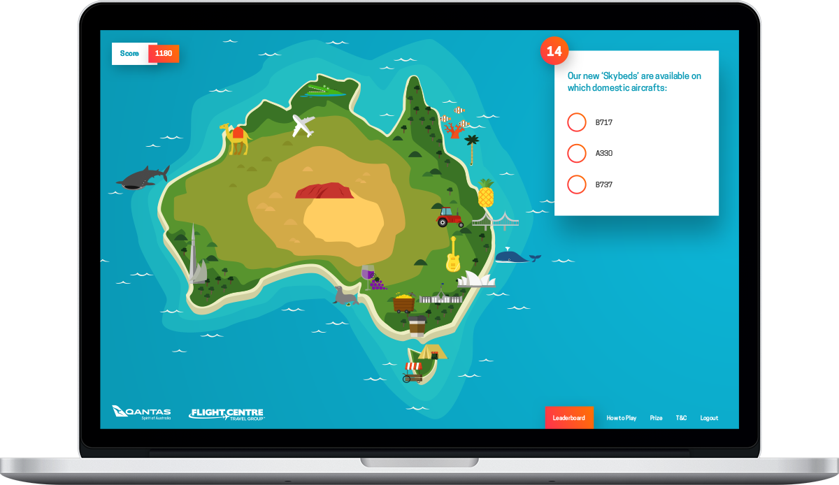
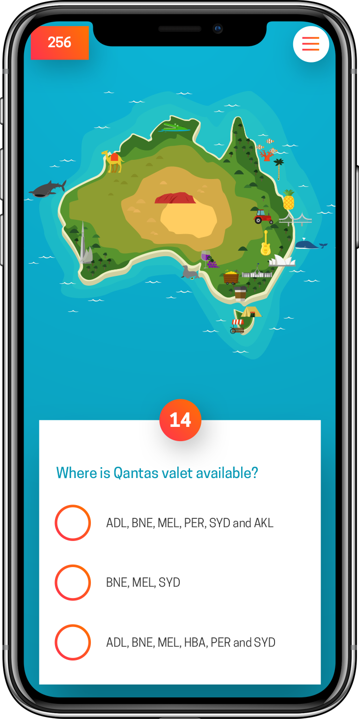
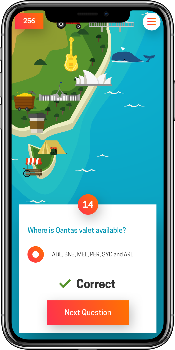
A bright and colourful map of Australia was designed and animated to feature the domestic destinations that the airline services. Icons relating to each destination, such as the Harbour Bridge in Sydney and a Whale Shark in Exmouth animated throughout the game as users answered questions correctly and progressed throughout the virtual board.
Animation was used to bring the game play to life, allowing users to see their Qantas A380 take off, fly across the map and land in the relevant city with each correct answer.
Research
The previous years competition was a scaled-back, print version of this competition but it provided a starting point to compare against, to see where we could take this project.
As these types of competitions are usually gated and only available to a select group of people there wasn’t the chance to find any direct comparisons with competitors so comparisons were done with external benchmarks to gauge what the potential was.
Wireframe
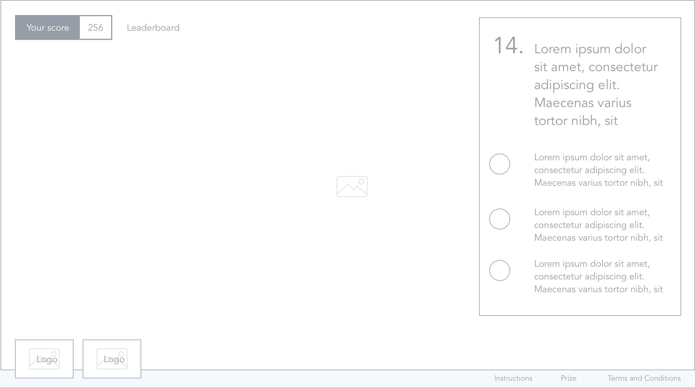
The wireframes were done whilst keeping in mind the need to condense a large amount of information on to mobile screens. The flow between each screen was decided at this stage and it was decided that a nav would appear at the bottom of the design so as to give maximum amount of real estate to the map.
Mockups
A stylised version of the Australian map was designed so that users would clearly be able to see and understand the icons that would appear as the user progressed around the map. The orange highlight colour was decided based on the contrast with the blue colour which appears in a majority of the site.
It was also decided to zoom in on mobile so as to see the icons more clearly while still giving the user the feeling of advancing around the map.
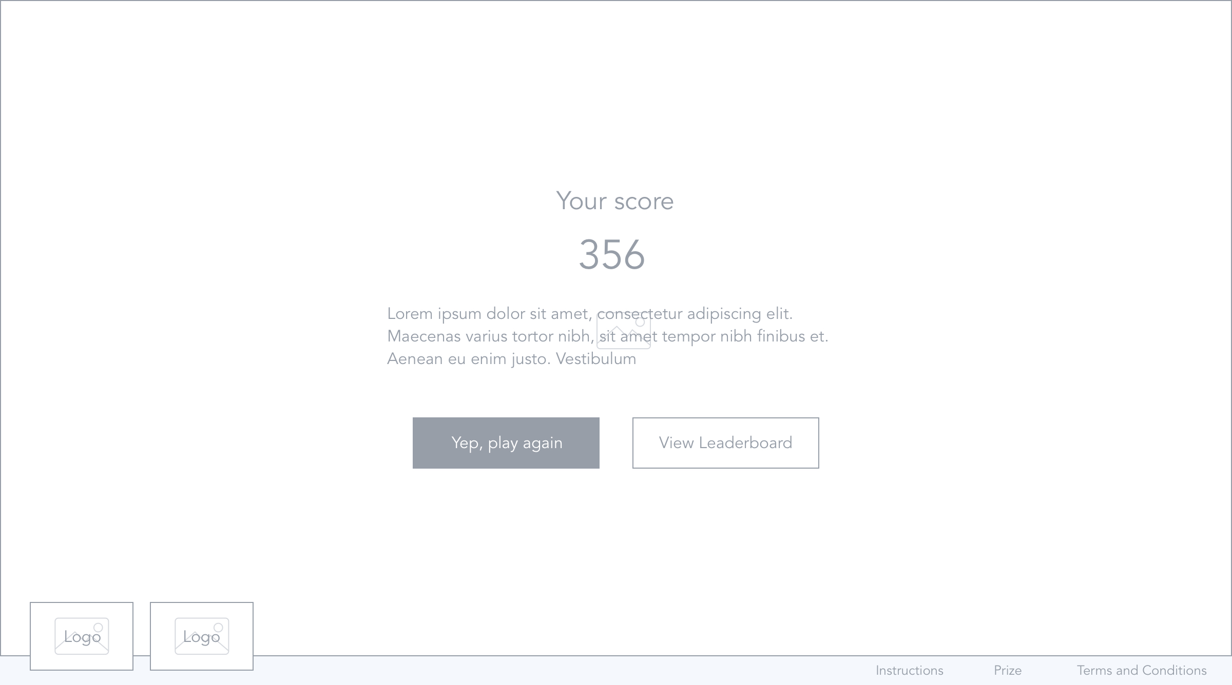
A series of pop-ups were used for any information that needed to be shown as there was minimal info to display and we didn’t want the user jumping out of the game.