Research
A lean ux process was required due to budgetary restraints so online surveys were conducted with the main users of the site, that being Students, Parents and Teachers. The results of these surveys provided us with some key insights into what the various users came to expect from a website such as this.
We also explored competitor websites and came to the conclusion that this particular segment was quite stale and by going down the path of a vibrant, youth focused look and feel we could set ourselves apart from the competition.
Personas
3 personas were then created based on our findings throughout the research phase and these personas were referred to throughout the process.
- Student
Students were after something that didn’t feel official and stuffy and appealed to their sense that they were being listened to and not just talked at. Students were also drawn to multimedia as videos and interactive pieces have become a critical way they digest information.
- Teachers
Teachers wanted something that was informative, legitimate and provided their students with meaningful help in the mental health space. They also wanted the information to be clearly presented and easy to digest so that they could then use that information to get buy-in from their superiors.
- Parents
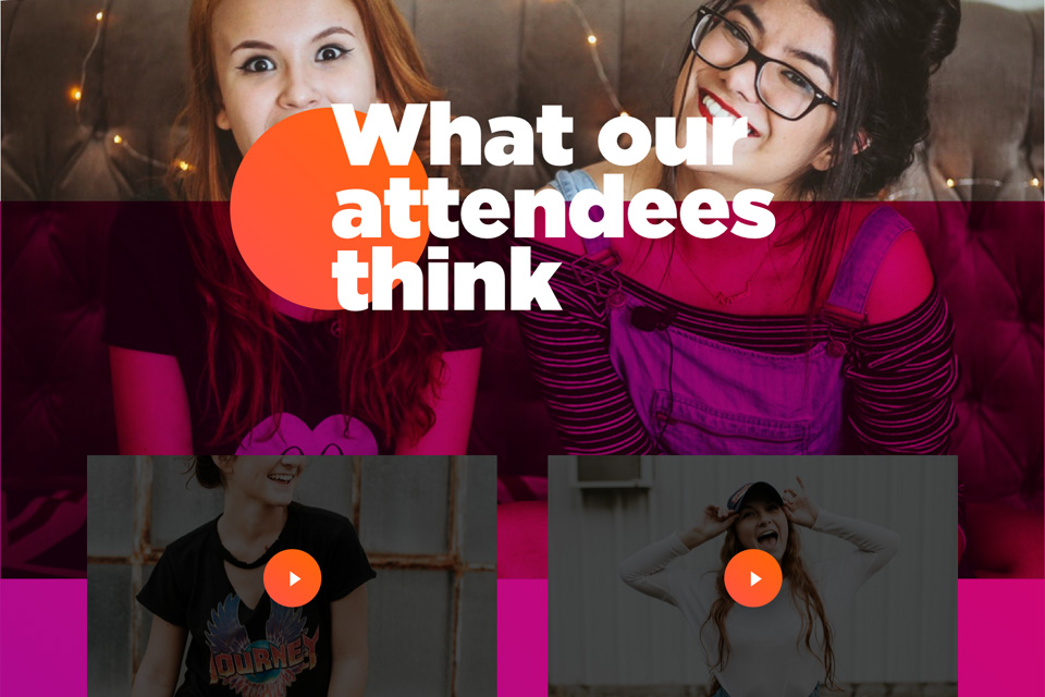
Parents needed a resource where they could get information that would help them be more informed when talking to their children about the subject of mental health. They would also like to see social proof that the Beautiful Minds platform provides real benefit to teenagers.
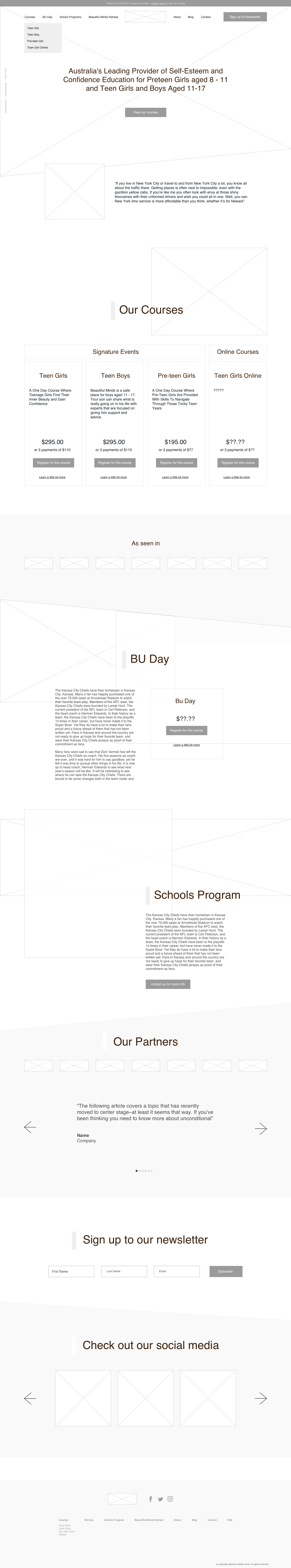
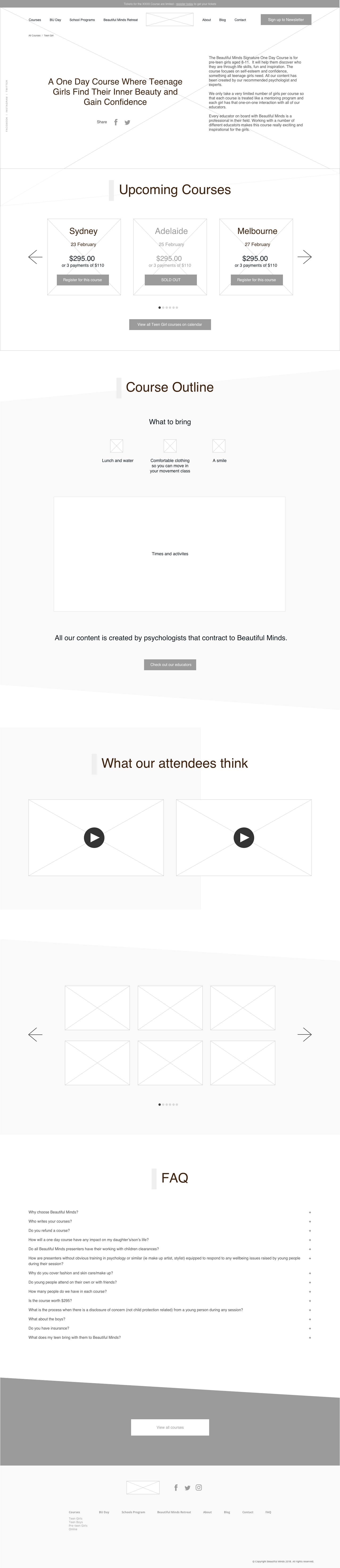
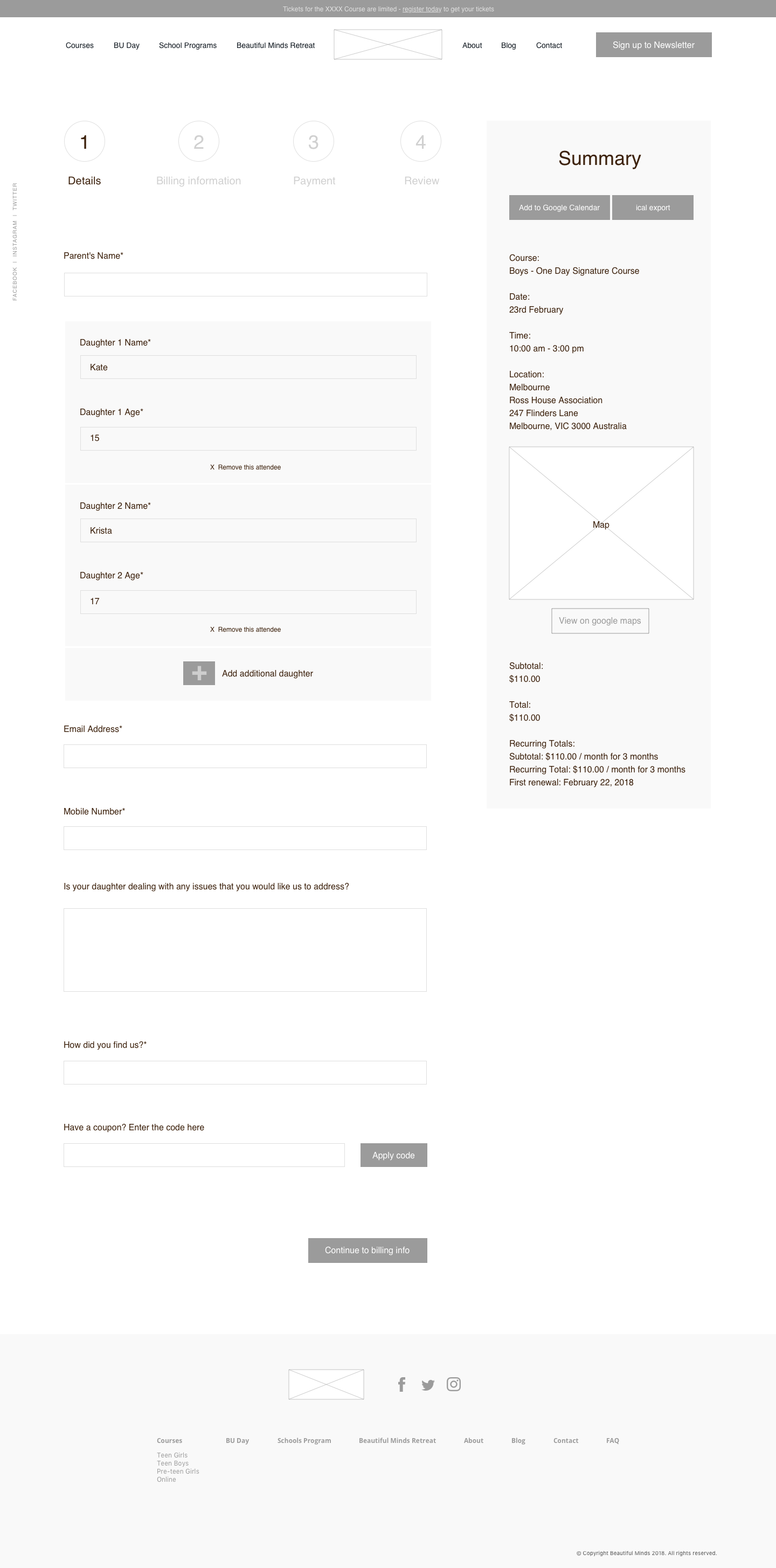
Wireframes
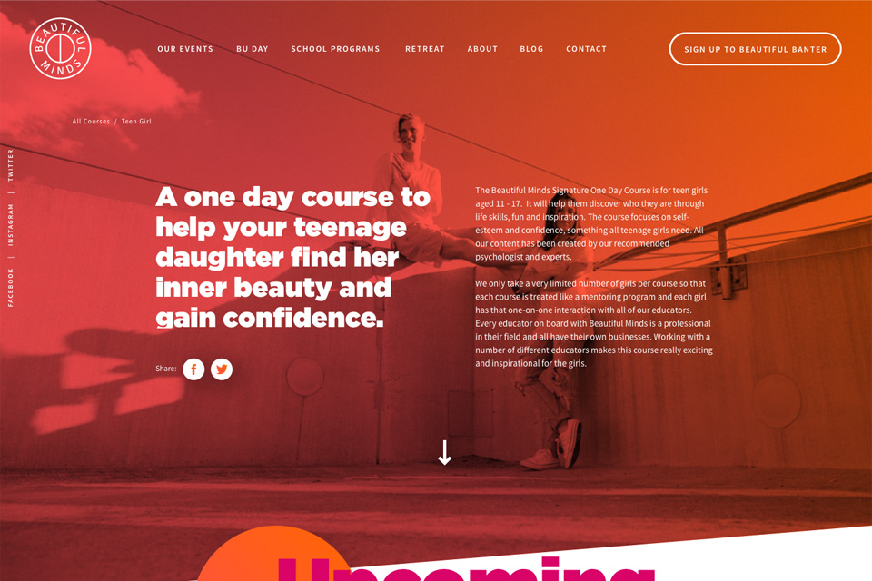
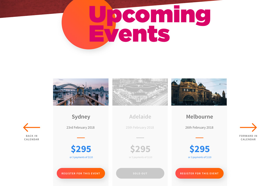
Wireframes were then created with the main focus being on the core user journeys and how they would achieve their respective goals. This was done through rejigging the navigation and also by providing clear content sections covering off exactly what Beautiful Minds offers the user and giving the user a clear next step.
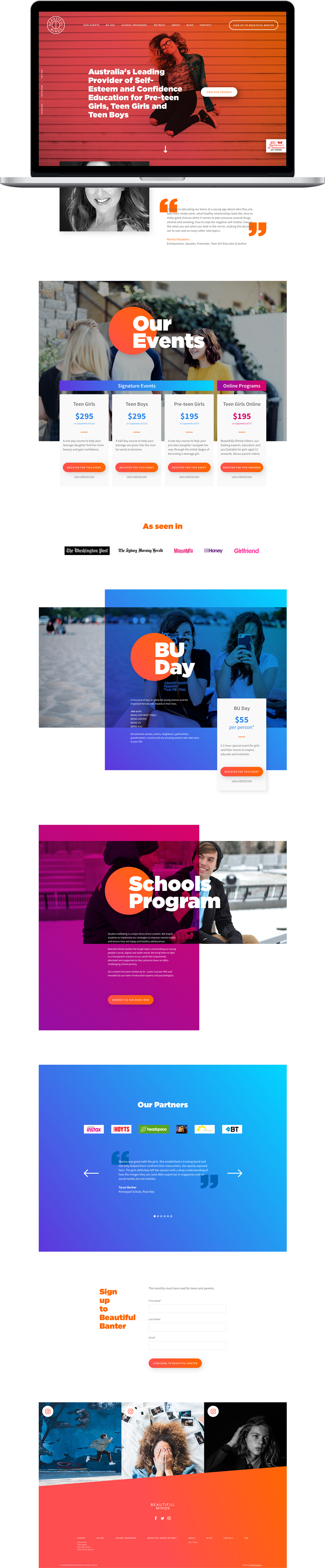
Mockups
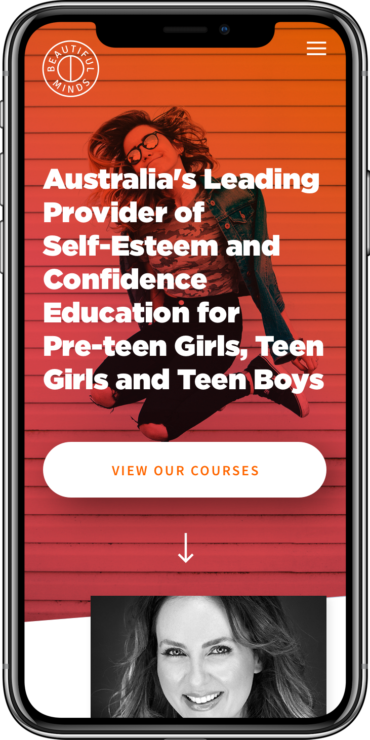
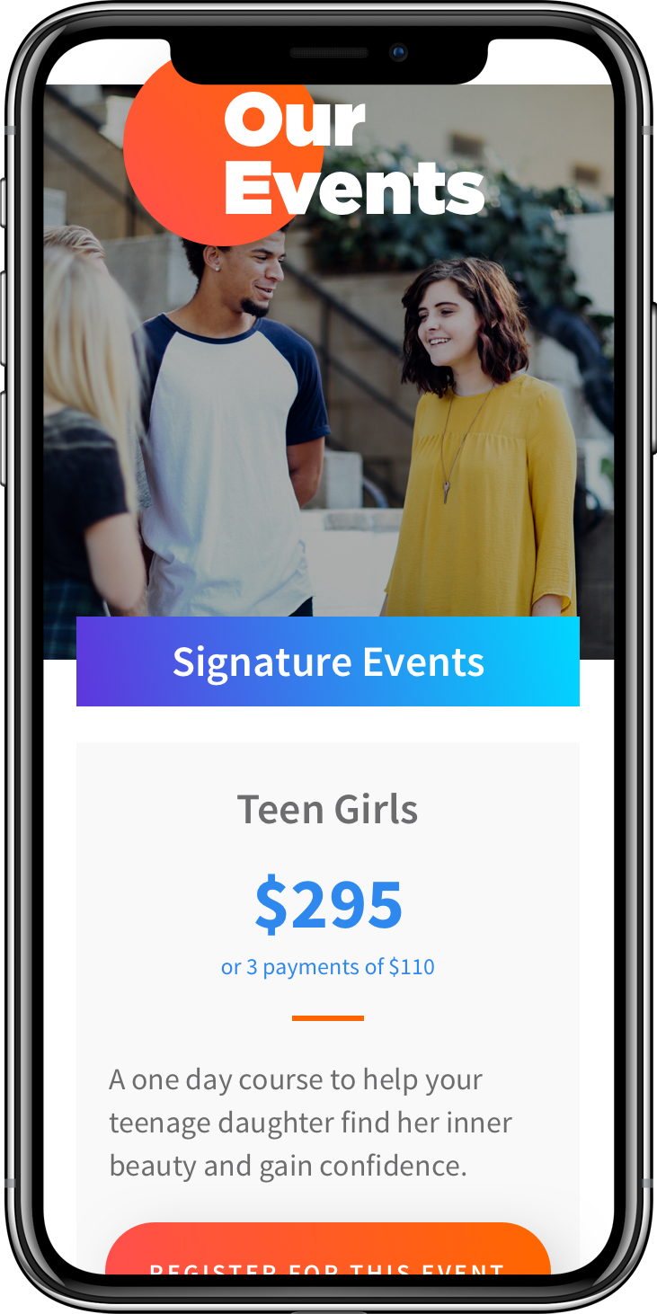
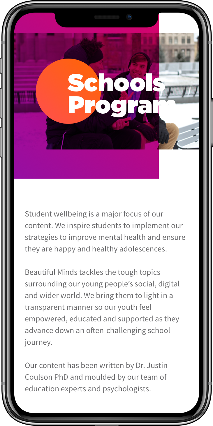
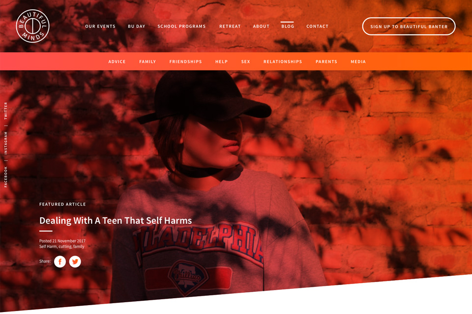
Finally the High Fidelity mockups were designed keeping in mind the need to appeal to the various user groups. Another key thought during the design phase was to make the large amount of information easily digestible, which was achieved through the use of a clear font hierarchy and ample use of white space.