Research & Concepting
We began with surveys and interviews with parents of 4–7 year olds to learn what both kids and caregivers value in children's apps.
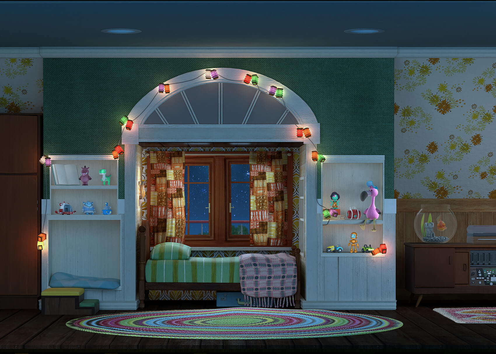
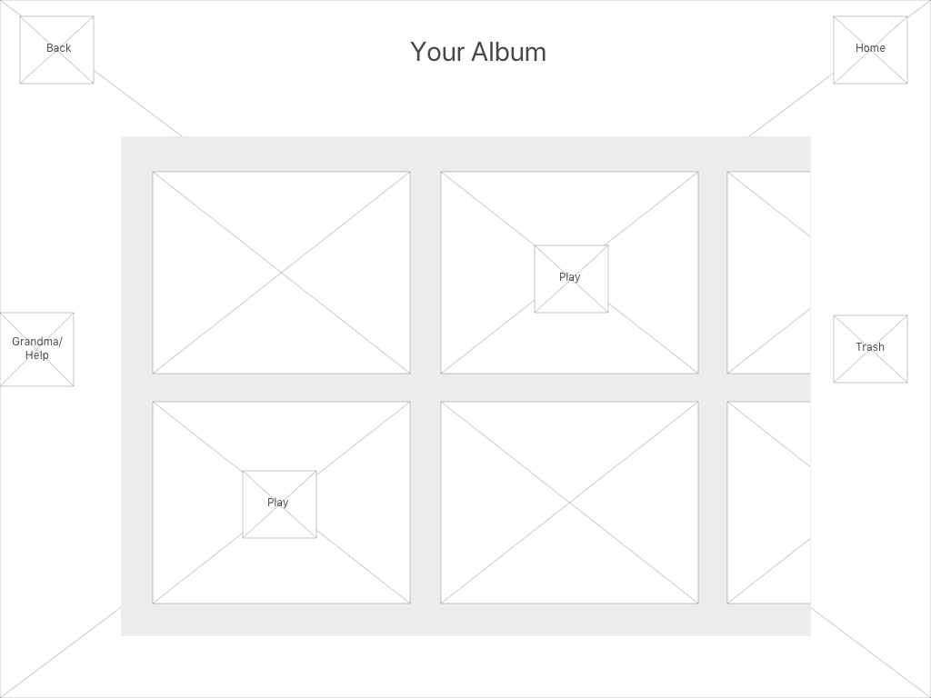
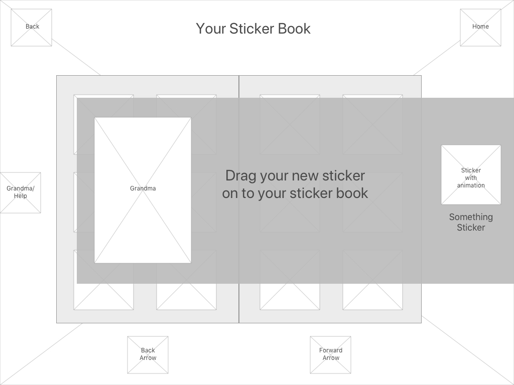
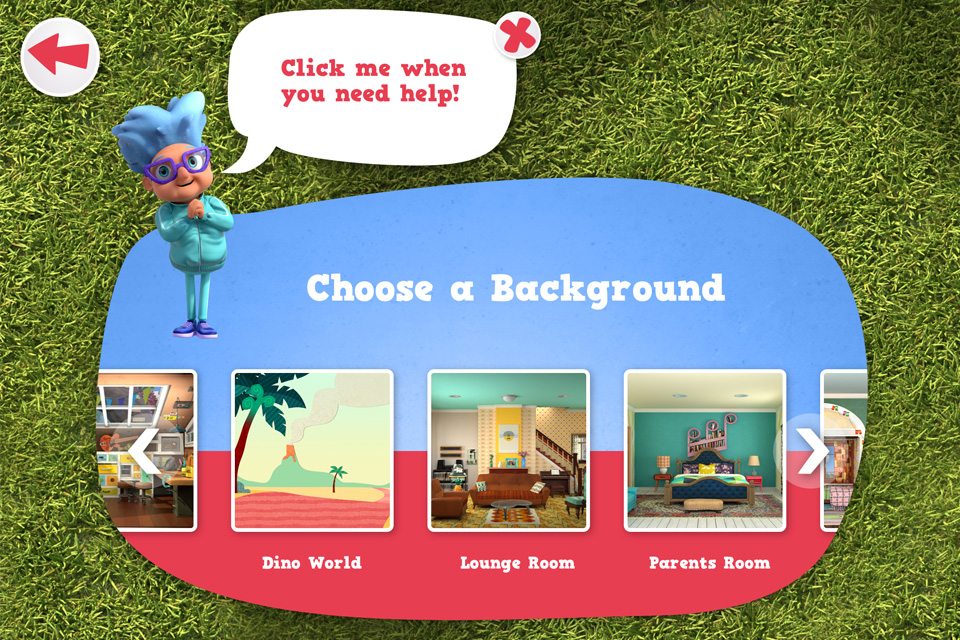
From this, a “Scene Builder” game mechanic emerged as the ideal format — offering freeform creativity and narrative control, aligned with the core premise of the show.
We then ran competitor analysis to identify UX gaps in similar apps, aiming to go beyond standard drag-and-drop scenes with something more tactile and immersive.
UX & Game Design
Key design decisions included:
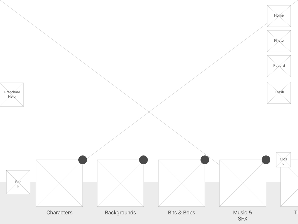
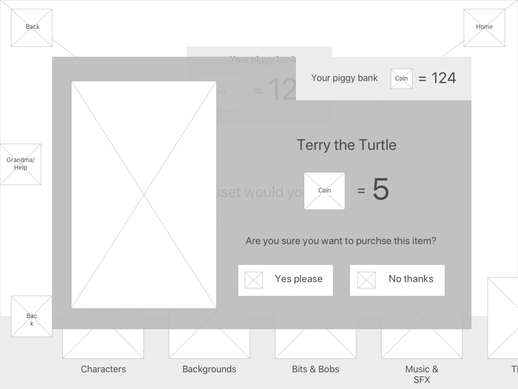
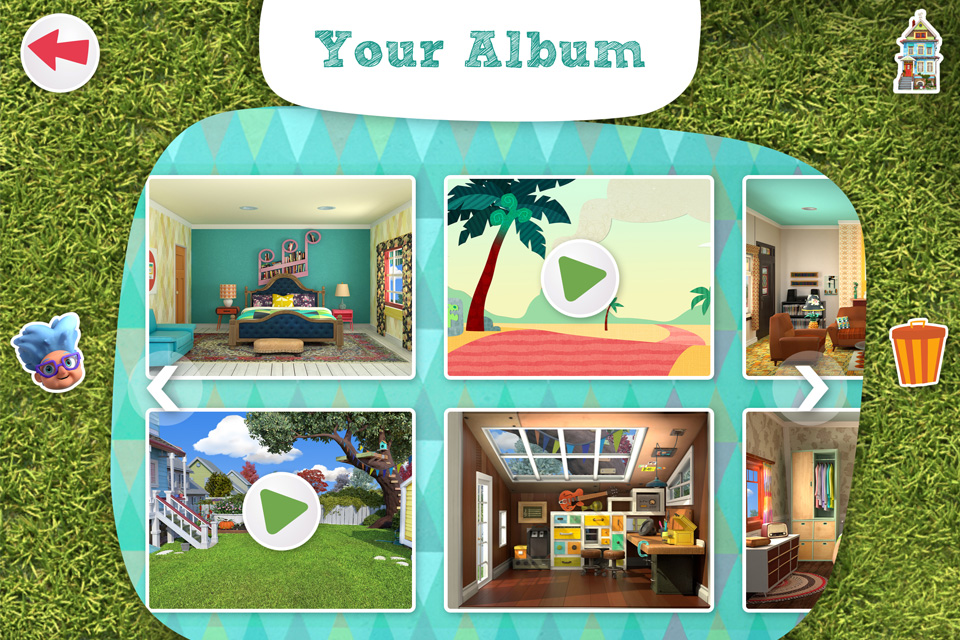
- A bottom drawer navigation system for item categories — easy to minimise and access without excessive scrolling
- A minimal on-screen UI with clear iconography and audio-visual feedback for all actions
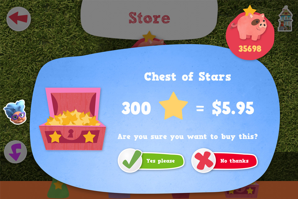
- A green = go, red = stop colour system for consistent interaction cues
- Large touch targets and progressive disclosure to keep choices simple
- Error prevention through immediate visual confirmation (e.g. character animations, sound effects)
Prototyping & Visual Design
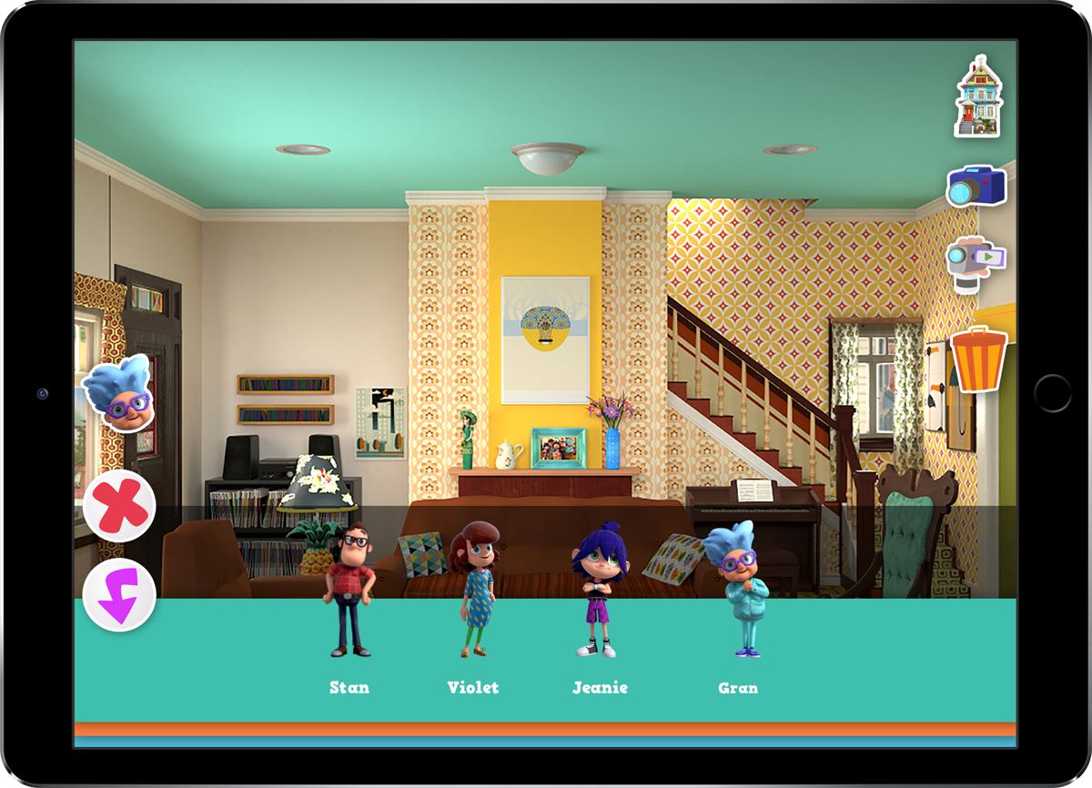
Early prototypes featured a clean UI, but the client requested a return to the brand’s organic shapes and playful forms, requiring a redesign that balanced form and function.
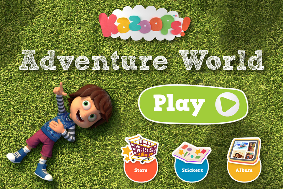
The final interface used:
- Vibrant colours and show-accurate characters to build brand recognition
- Child-friendly typography with intentional sizing and spacing
- A layout that put the focus on creative expression, not cluttered controls