1. Discovery & Research
We kicked off with a structured discovery phase — stakeholder interviews across marketing, digital, product, and compliance; analytics deep-dives to understand traffic patterns and drop-off points; and a full heuristic audit of the existing site.
We also ran user research sessions with a cross-section of Pepper Money's core customer segments: first-home buyers, self-employed borrowers, and customers with non-standard credit histories. The insight was consistent — people didn't feel seen by the site. The language was cold, the journeys were confusing, and trust was never established before conversion was asked for.
2. Audience Mapping & Personas
From research, we developed a defined set of personas that captured the emotional reality of borrowing outside the mainstream. These weren't just demographic profiles — they captured the uncertainty, the financial hope, and the specific concerns of people who've been turned away before.
These personas became the foundation for every IA and design decision that followed.
3. Information Architecture
We restructured the entire site hierarchy from scratch. Navigation was rebuilt around customer intent — I need a home loan, I'm not sure if I qualify, I want to understand my options — rather than around Pepper Money's internal product taxonomy.
A full content audit identified what to keep, consolidate, or cut. Product pages were streamlined to lead with clarity and empathy before diving into product detail. We mapped primary, secondary and tertiary user journeys for each persona, ensuring every path led to a meaningful next step.
4. Wireframing & Prototyping
With IA signed off, Cypha moved into detailed wireframes covering all key templates: homepage, product landing pages, eligibility and rate pages, broker tools, and resource hubs.
Wireframes were tested iteratively with both internal stakeholders and real users. We refined content hierarchy, CTA placement, and page flow based on direct feedback before a single pixel of design was committed to.
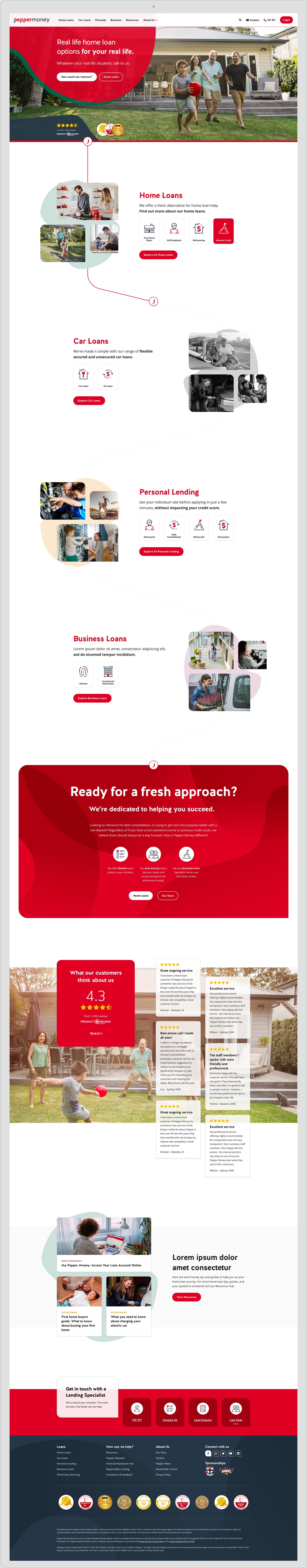
5. Visual Design & Design System
The creative direction centred on one idea: warmth with confidence. Pepper Money lends to people navigating real, often difficult, life moments — the design needed to earn trust quickly and communicate clearly under pressure.
We introduced a bold typographic hierarchy, a warmer, more expressive colour palette extending Pepper Money's existing brand, and photography direction that put real people — not product screenshots or abstract finance imagery — at the centre of every page.
A full, component-based design system was delivered alongside the final designs, giving Pepper Money's internal team a scalable, consistent toolkit for all future digital work. Every component was documented for both design and development handoff.